


Nastya Ispekla – Pastry Shop that tastes good!
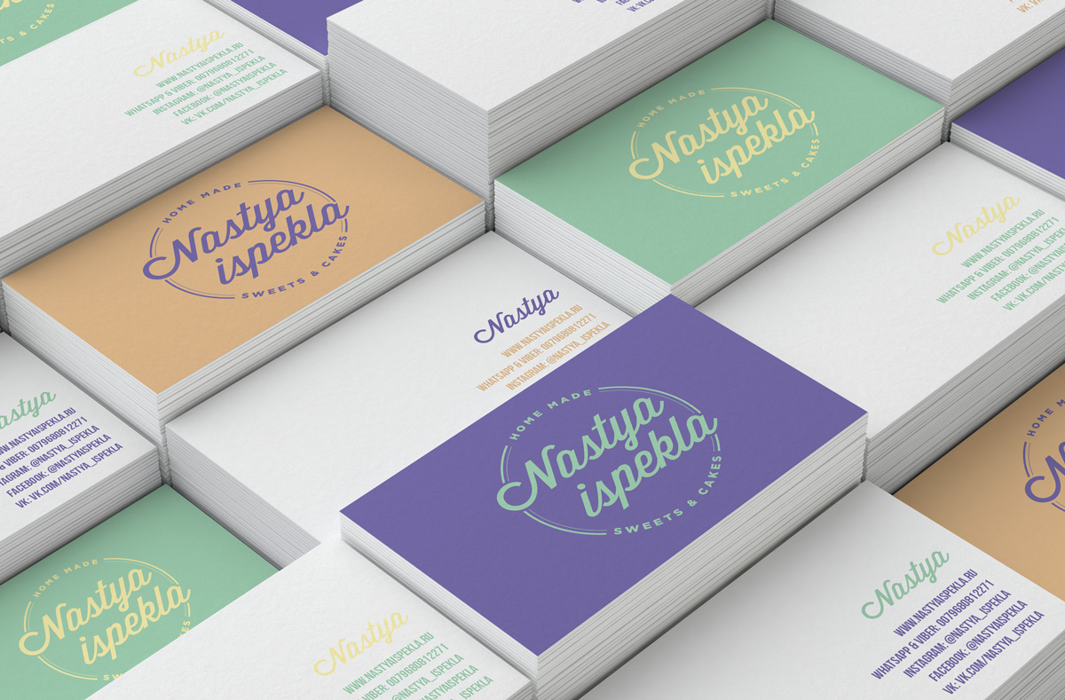
To cook up a good recipe you need the right ingredients, but to tell the story of a new generation of patisserie you need to create a corporate image with a fresh flavour.
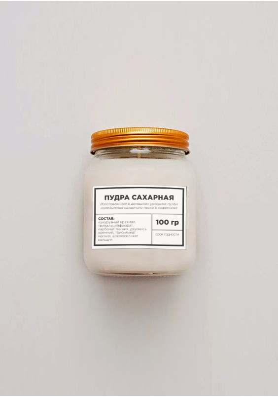
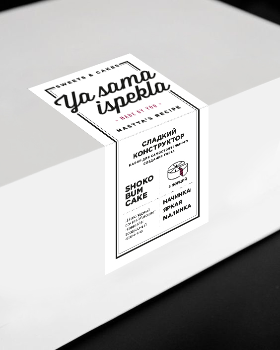
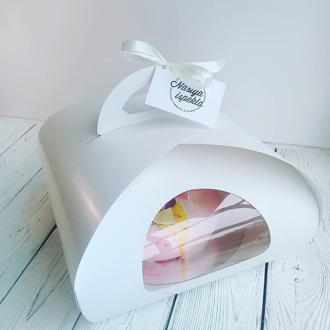
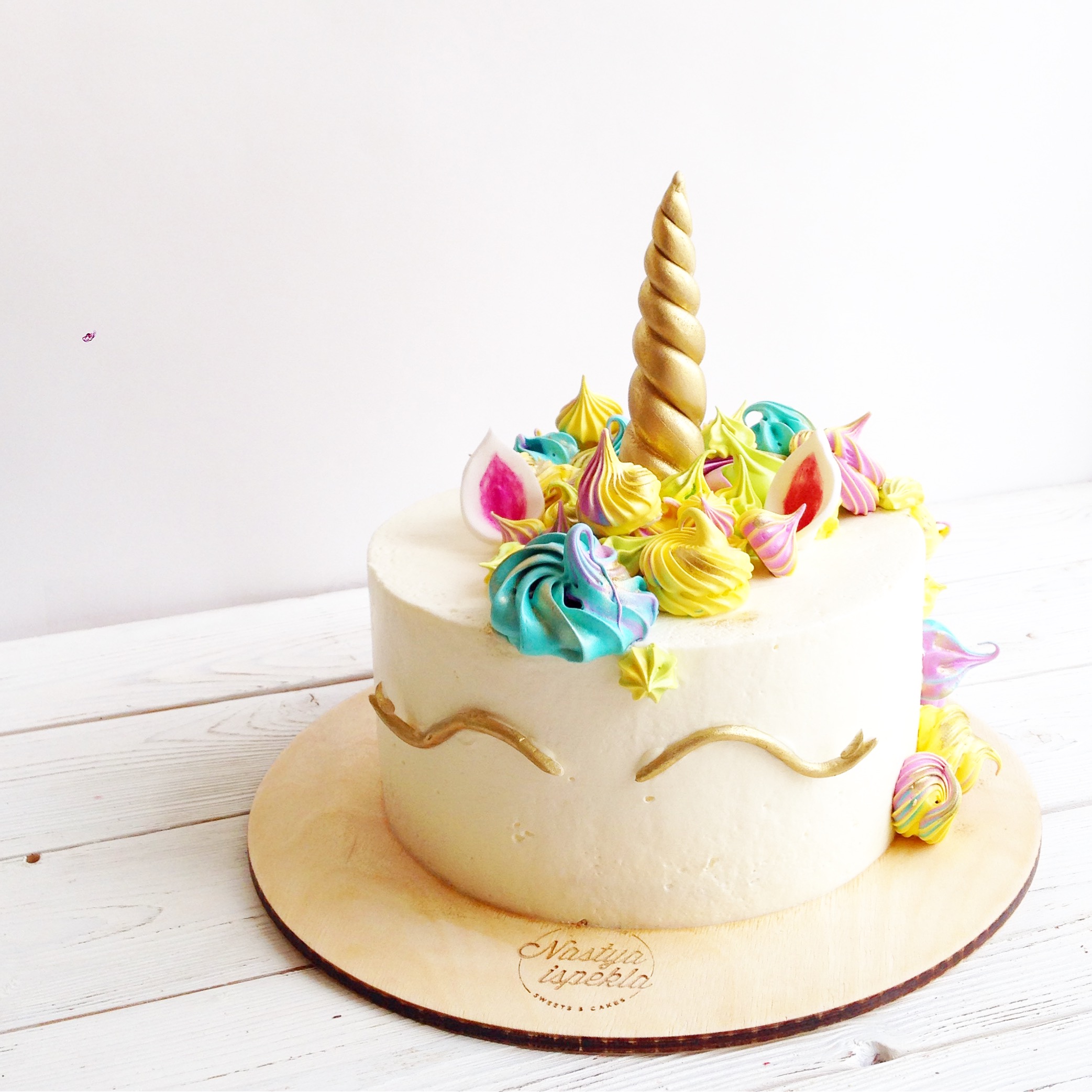
Following this input, an essential but striking transformation was born. In a nutshell, the visual identity of Nastya Ispekla pastry shop (from the Russian “Nastya Ispekla” meaning Nastya baked it). Resulted in small and large Russian delights that were framed in muted colours and premium packaging; between these essential graphic elements and the unique style and taste of the products, a new style was created that reflects those of Nastya’s sweets 😉
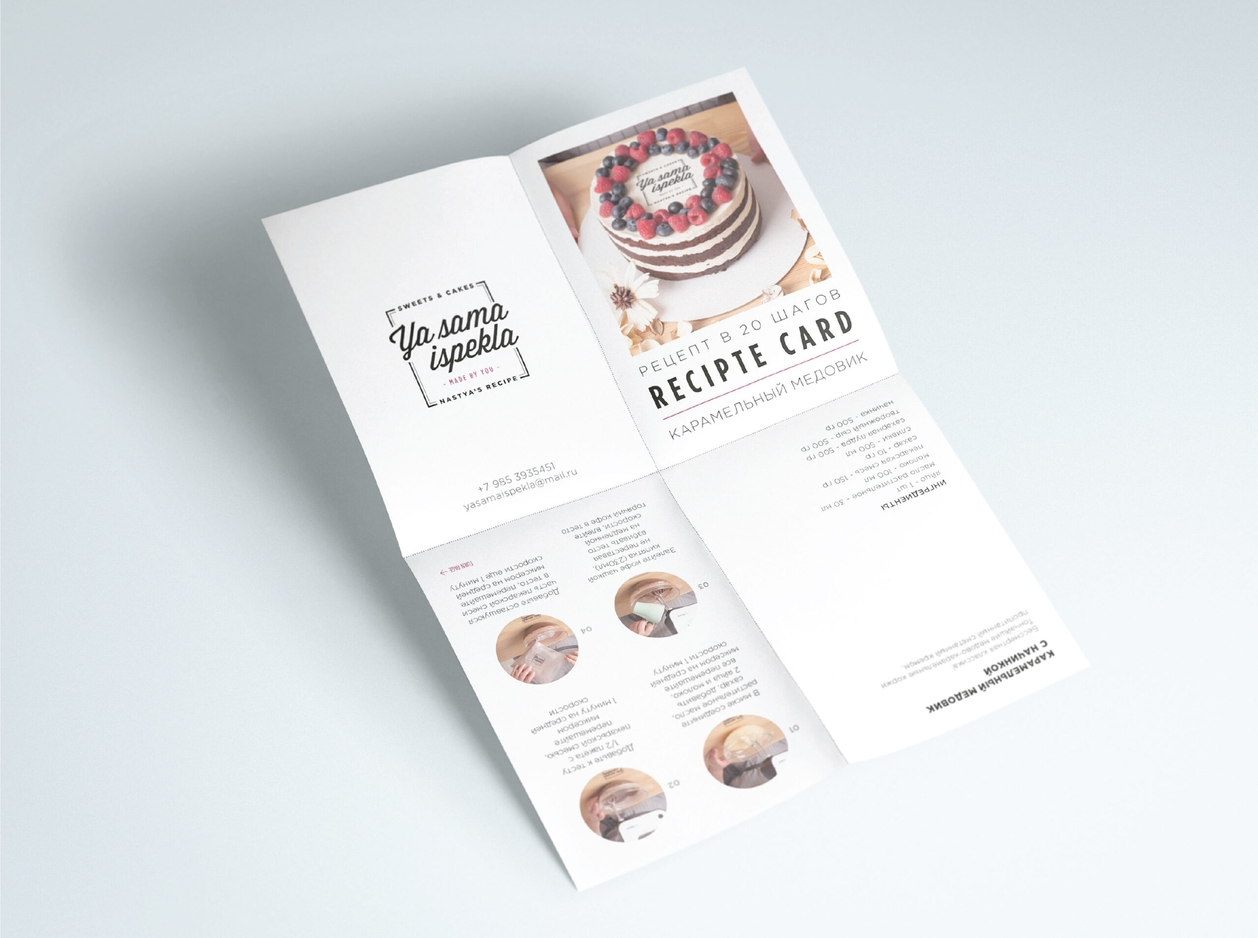
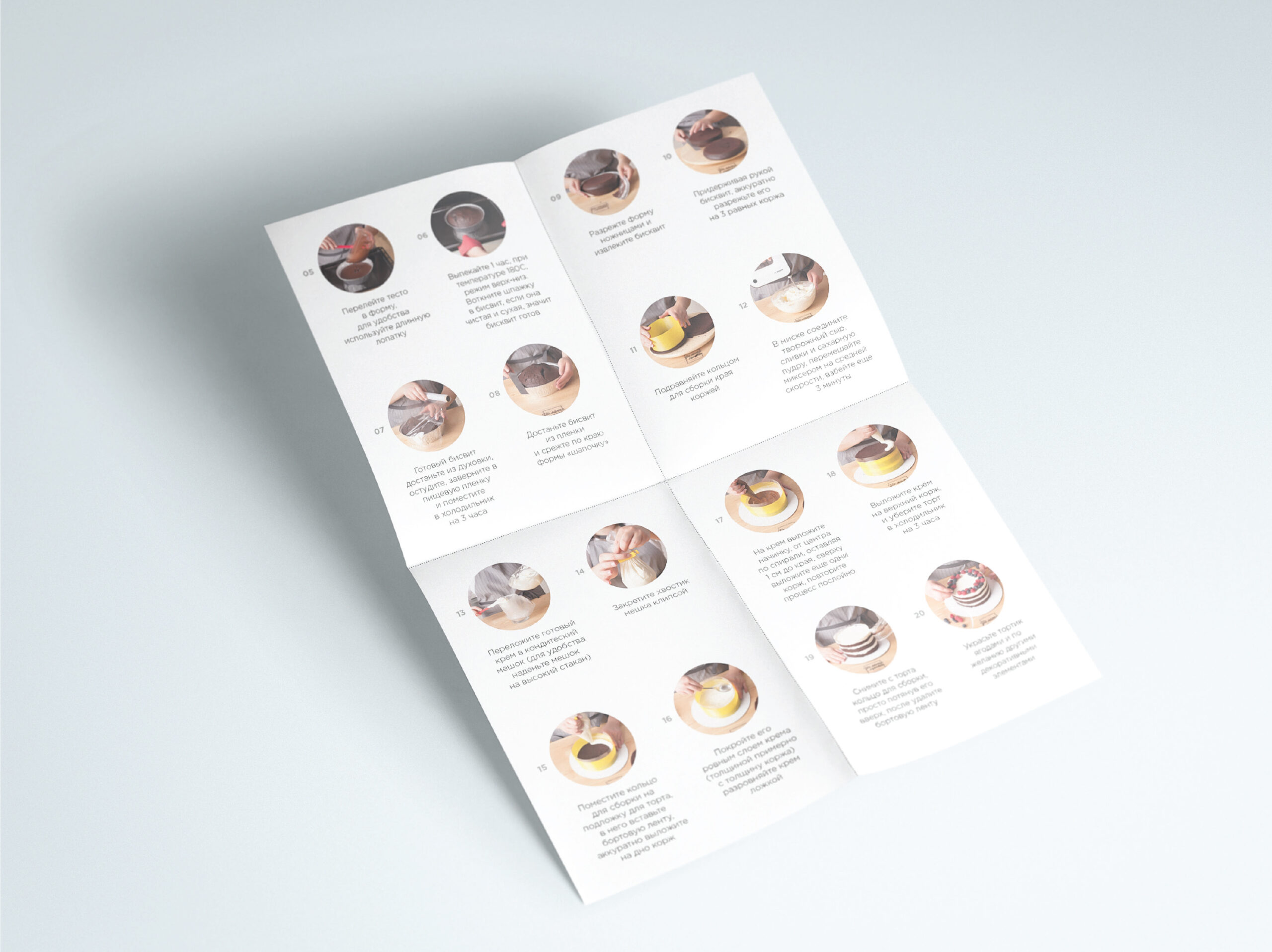
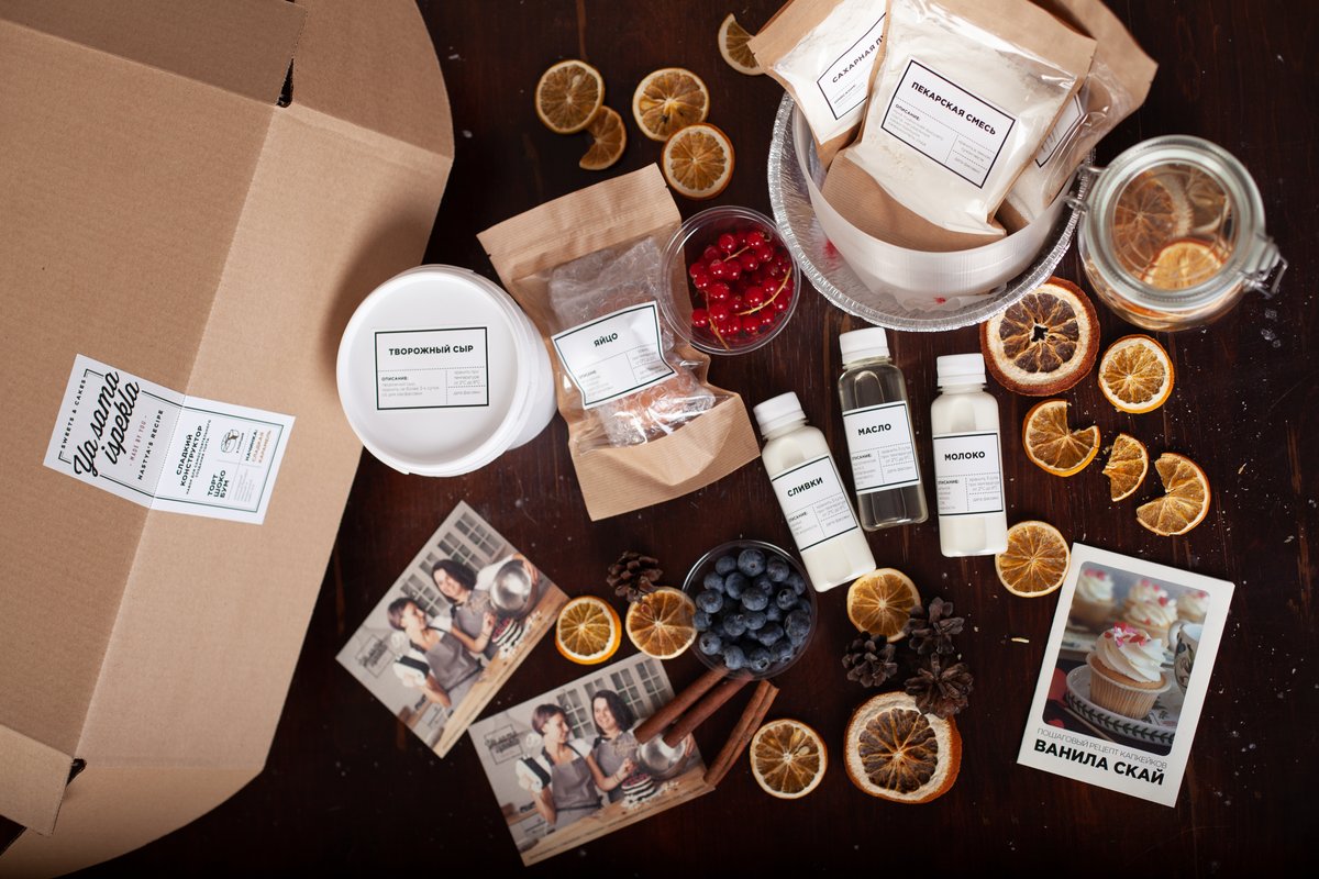
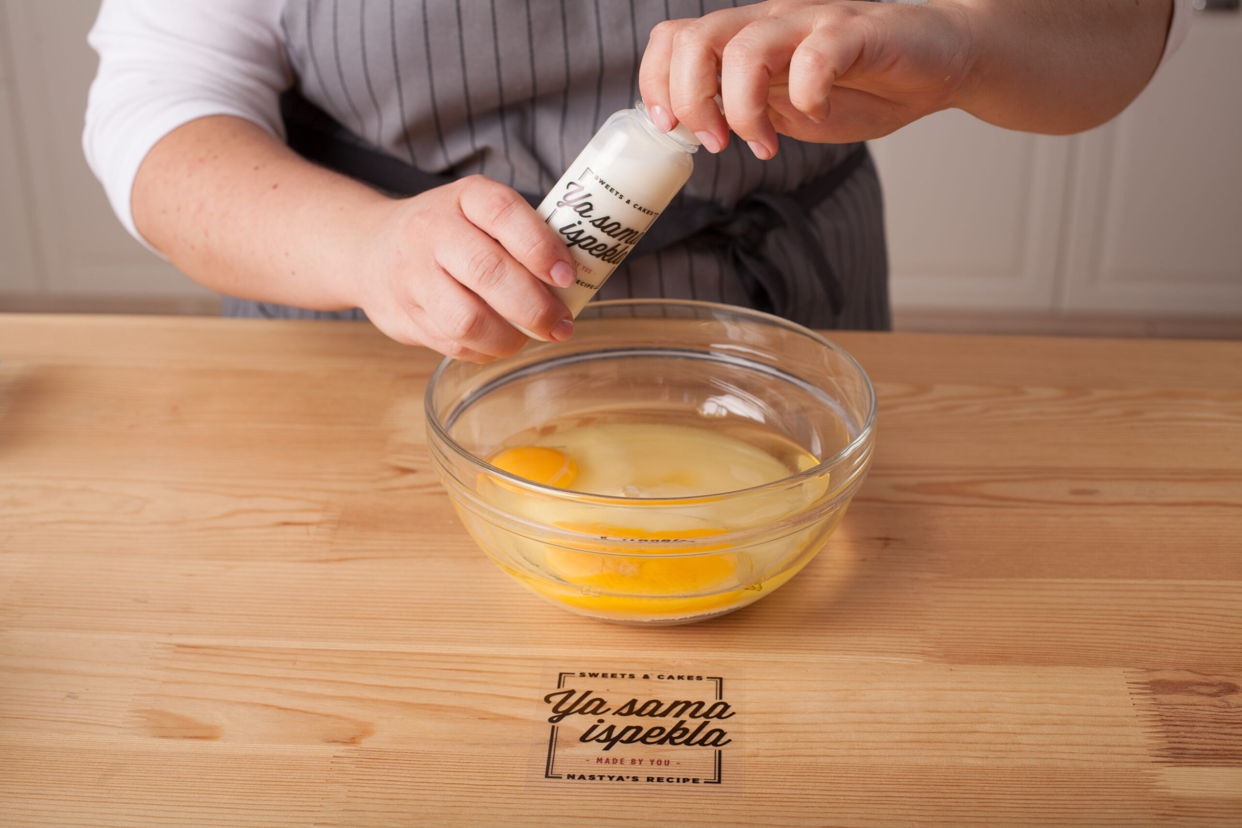
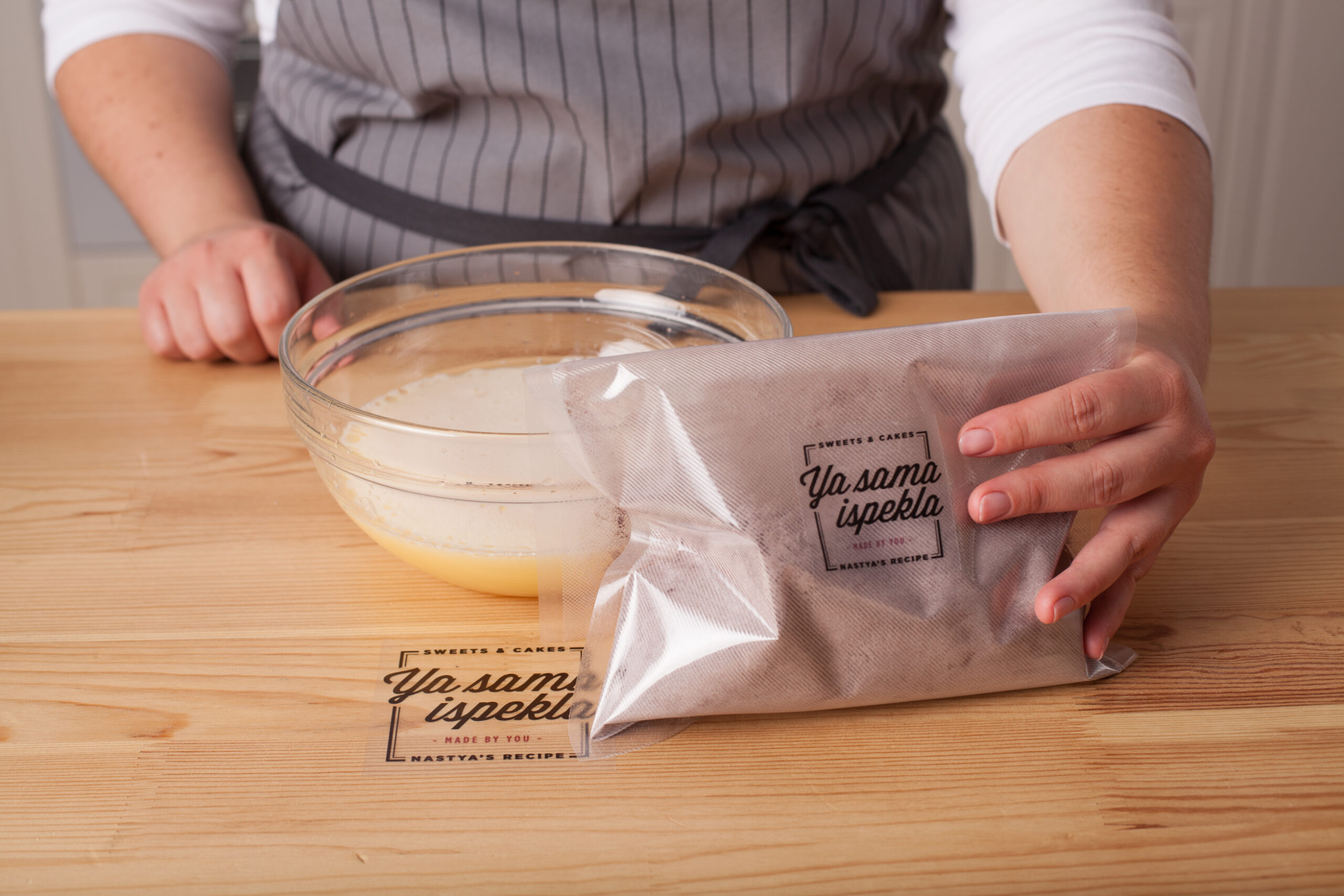
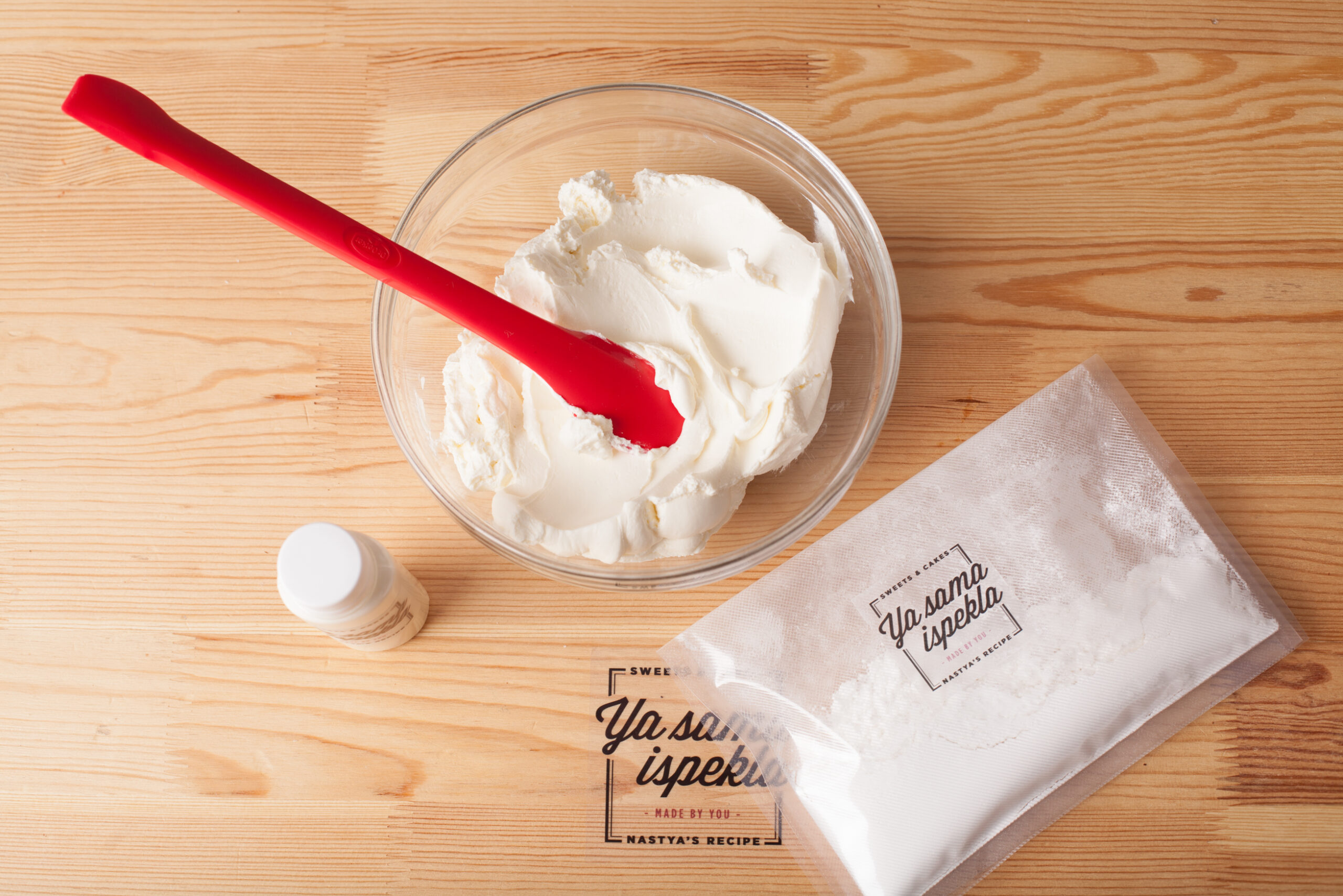
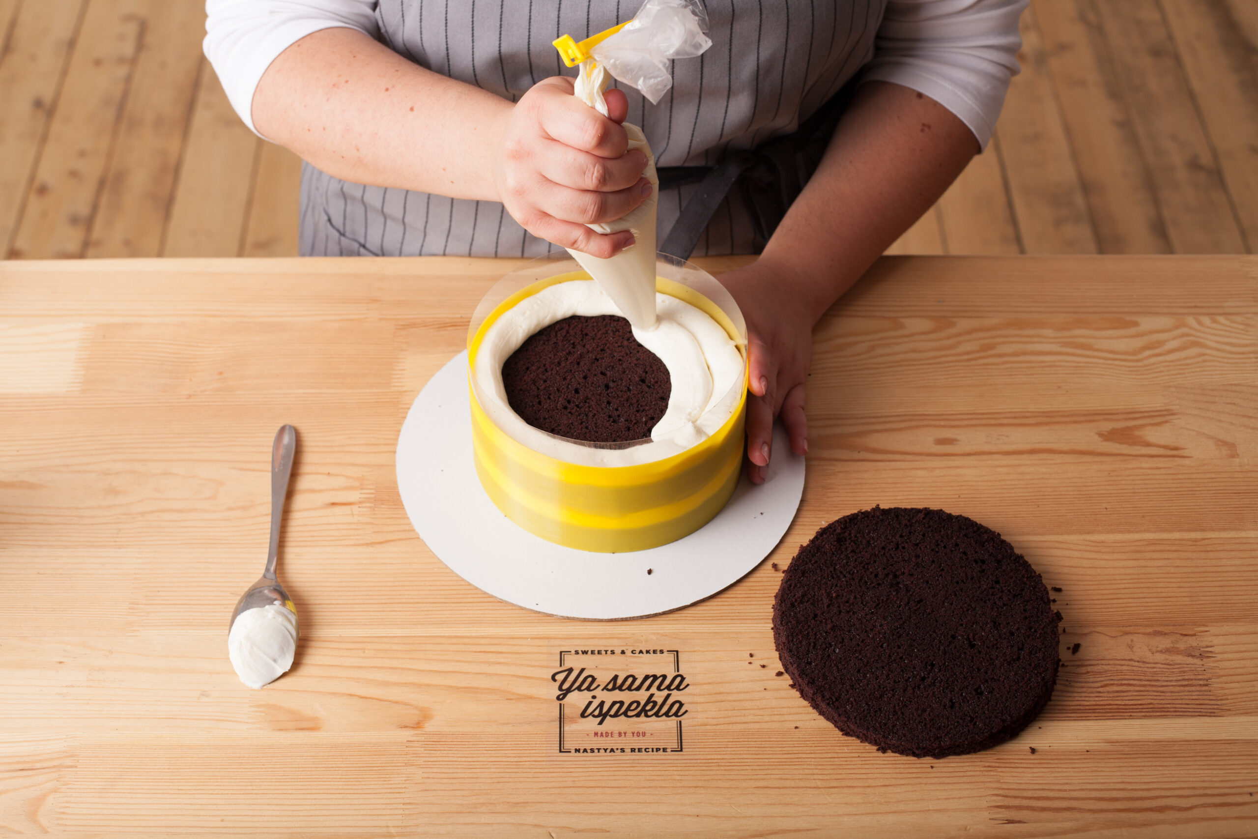
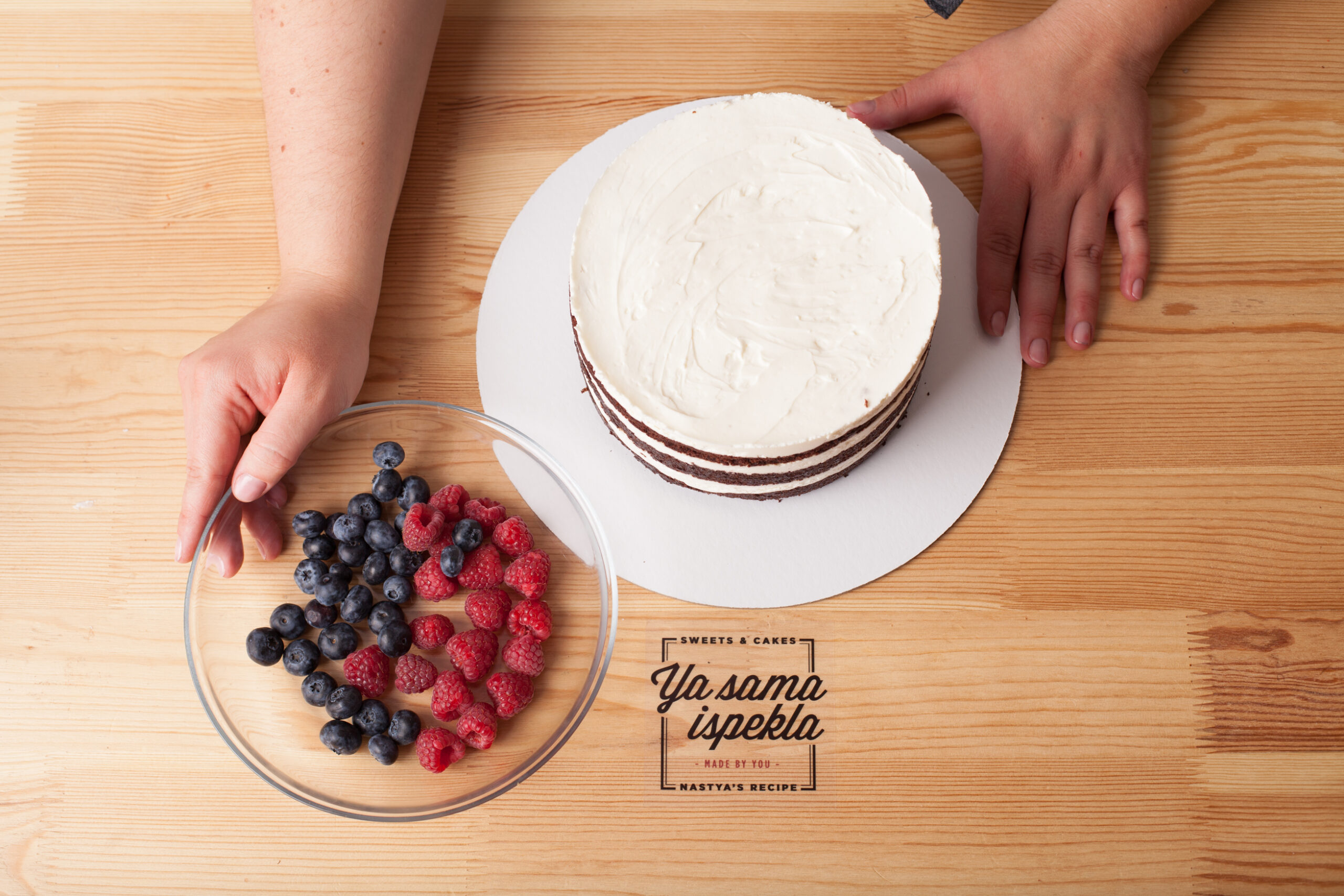
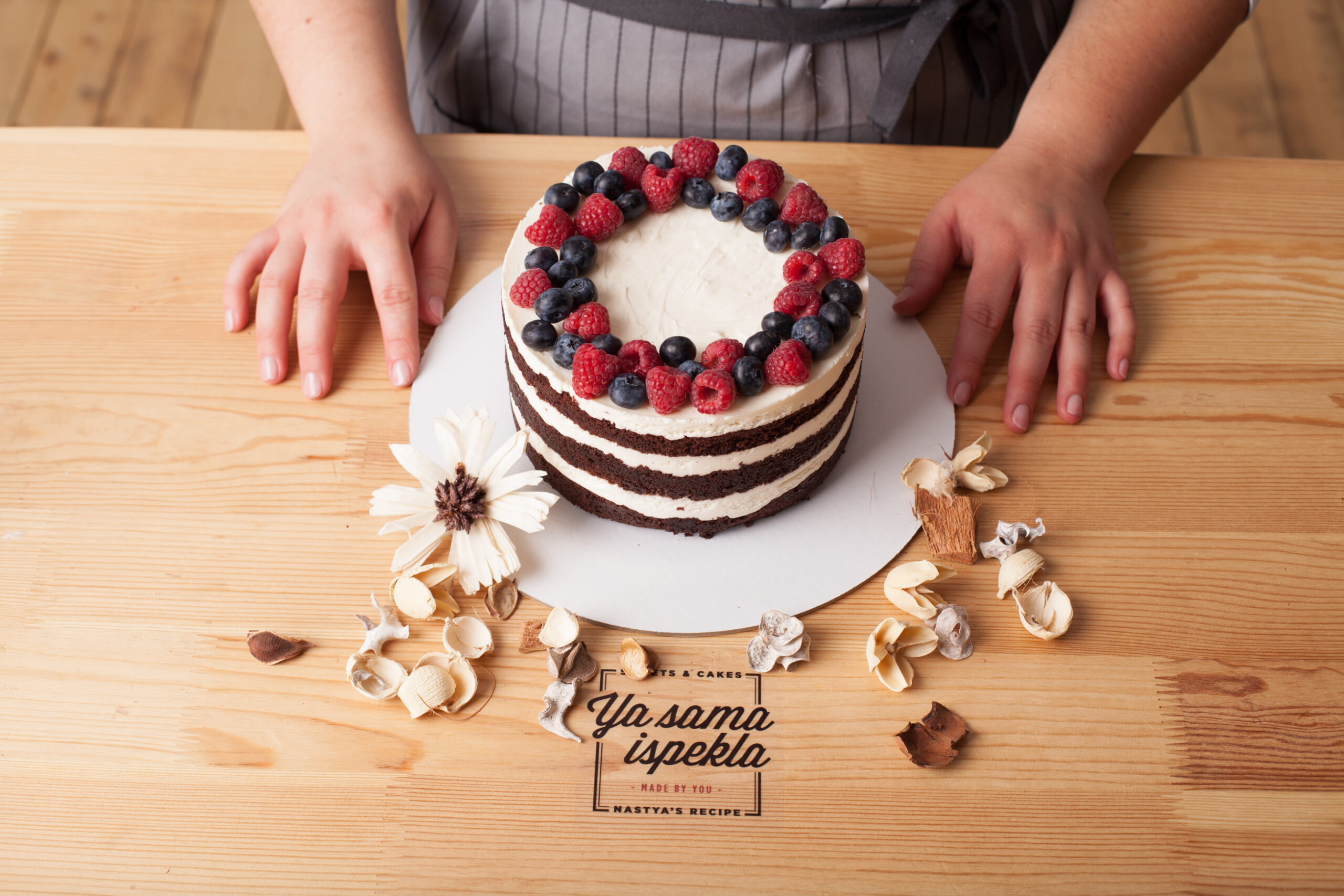
After the great success of the initial project, the brand identity was extended to the parallel project “Ya sama ispekla” (from the Russian “I baked it by myself”). In this case, the graphics were adapted to a delivery box containing all the ingredients and quantities needed to create the individual recipes independently. To make it even easier, we added step-by-step instructions with photos.
Client
Nastya Pastry ShopProject
Graphic DesignTypology
Corporate image (logo, business cards, labels, recipe brochures)Location
Moscow, RussiaYear
2016 - 2019In collaboration
Michele CecchiniDate
August 26, 2023